Visualising data to inform customers about their energy usage
-
-
-
Background
The context
Orion Energy Technology is an energy platform provider. The platform is licensed to retailers to manage billing, payments, direct debit, energy usage, and assisting with home moves. Its current client is one of the biggest energy companies in the UK, OVO Energy. This project is about helping OVO Energy customers understand their energy usage.Energy Usage page shows users their yearly/monthly and daily energy consumptions for electricity and gas. We also show comparisons to users so they can compare their past energy consumption with the current one.
-
Problem
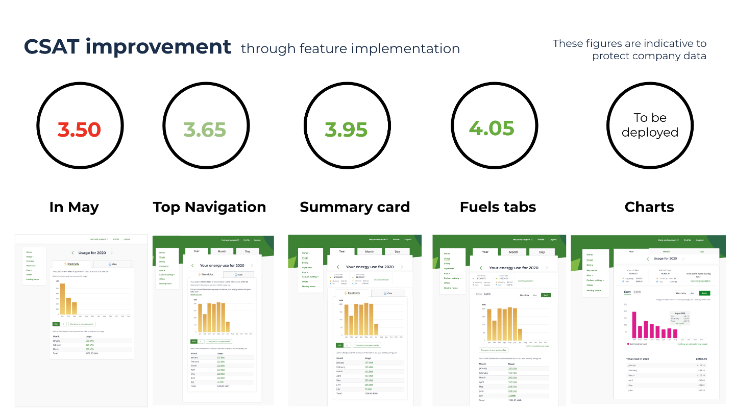
The team was formed during Coronavirus times in May 2020. We saw Energy Usage Customer satisfaction score was very low at 3.50 and the target was 4. The challenge was to find out why the CSAT dropped and how we could fix it. The CSAT score is indicative to protect the company data.
Impact
Increased customer satisfaction score from 3.50 to 4.05 in four months. These figures are indicative and not company data. This is to protect company data.
Solution
The solution was to present complex data in a simple and concise manner to web and mobile customers.
My role
I led the team to enhance the user experience of the energy usage area of the Saas platform. I also brought in a discovery led approach to the team by setting up and conducting regular research and testing sessions.
-
My process
-
-
Problem
The CSAT was very low!
In May 2020 customer satisfaction score (CSAT) was very low for the Energy usage section at 3.50.The challenge was to find out why the CSAT had dropped and how we could fix it. The team was formed during the Coronavirus epidemic. Company policy was not to disturb our customers with any additional research requests during these challenging times.
-
Problem
User flow
-
-
Discovery
When will we know we have succeeded?
The OKR for the team was to increase CSAT to 4.00. (These figures are indicative and not company data. This is to protect company data.)
-
-
Discovery
Heuristic analysis
Homepage
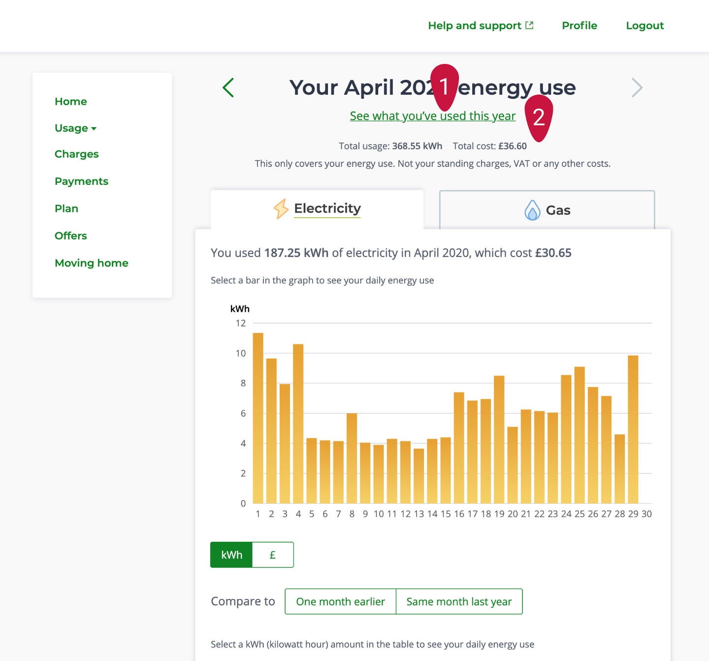
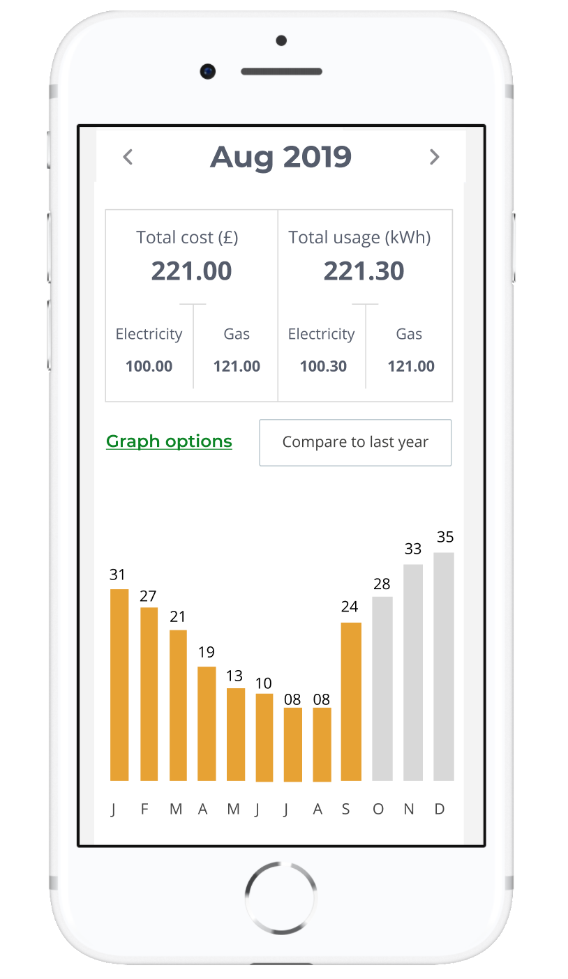
- 1. User has to decide in the navigation bar if they want to see a monthly or yearly view. Also if they want to switch from yearly to monthly, they have to form a navigation bar. There is no indication in the navigation bar that there is a daily view available too
-
Year view
- 1. Copy about energy use in kWh and cost is hidden they way it's presented
- 2. These bars are clickable but there is no indication that they are clickable. The linear gradient used to fill a bar is relative to its height instead it should be based on the height of the chart to convey the right relation between dark blue and high values.
- 3. There is no indication of estimated usage
- 4. The Cost/kWh toggle provides an important point of interaction and it is used to control the chart view. It should be in a more prominent position.
-
Month view
- 1. This link of switching to year view is not very visible to the user due to its placement.
- 2. Total usage/cost is hidden as this area is very cluttered.
-
Day view
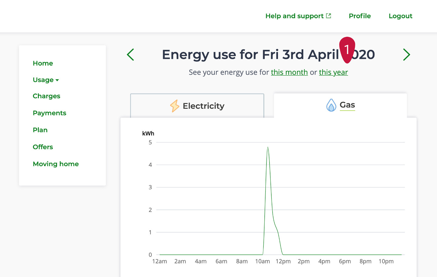
- 1. Daily view is completely hidden and can only be viewed once a user clicks on a bar on the month chart. There are no indications that the bars are clickable.
-
Mobile
- 1. There is too much text in the top of the page
- 2. Upon the selection of the two tabs Electricity/Gas the user is prompted to read again a lot of text before exploring their chart
- 3. The chart uses too much estate
- 4. The comparison with a line chart is not easy to grasp
-
Discovery
User research
The team relied on User surveys, data analytics tools and screen recording tools to give us insight into user behaviour. Instead of interviewing customers we interviewed customer care agents to uncover customer problems.
Interview with Customer agents
- 1. Users called agents about not finding the day page and had problems switching between month and day from the side navigation.
- 2. Users also overlooked important information as page was text heavy
- 3.Line chart used for comparison between years looked faint and hard to read
-
Data from User surveys
- The company used Usabilla to ask for feedback and measure the CSAT score
- 1. Cost was more important than kWh to users
- 2. Missing data of previous years which led to not being able to compare current year with last year
-
Data from Analytical tools
- Mixpanel is a tool that gives data insights about customer interaction on the site
- • The tool showed very low visits to day page ( only 3%)
-
Data from screen recordings
- Fullstory is a tool that records user interaction with a website or portal. To explore user interactions I viewed 50 videos. The insights were:
- 1. Difficulty finding day page - I could see in the video that users were finding it difficult to navigate to the day page. They clicked many buttons before reaching the day page and stayed there for some time
- 2. User spent a lot of time reading the copy. I could see that from how the cursor moved in videos.
-
Ideation session with the team
This was the first remote ideation session for the team and everyone used different mediums to express their ideas.
-
-
Experimentation with data visualisation
Exploration of data visualisation ideas
As there were many ideas, many business and user considerations and device sizes I decided to experiment and find the best way to show usage. Below are a few different designs that we considered
-
-
-
-
User testing
Testing designs
We interviewed and then did testing with 5 web users and 5 mobile users.
By this time, the company had allowed designers to contact our customers for the purpose of interviewing and testing. We tested the below designs: -
Desktop
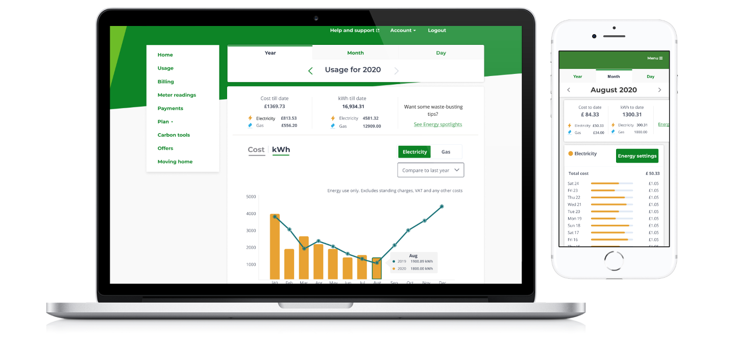
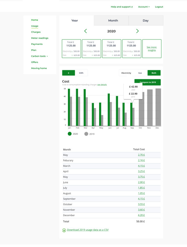
- For the Desktop version I identified and added the following features:
- 1. Tab navigation for Year/month/day on top of the page, which made the day page very visible which was previously very hard to find
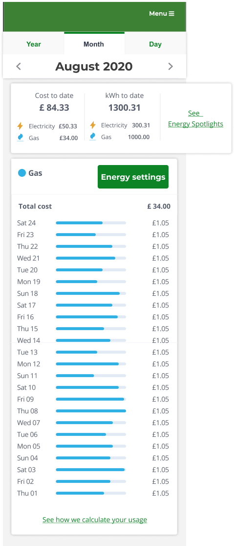
- 2. Created a summary card which showed total cost and total kWh. Total cost and kWh were further split by gas and electricity which gave a clear picture to the user how much they were using and by what fuel
- 3. Simplified the charts and worked on hover bubble to show less but accurate data for a bar
- 4. Comparison charts - Introduced thick lines instead of line charts to test if the comment about seeing comparison data month by month or year by year was valid would make the chart easier to compare with the bar
- 5. I added a key to the chart to explain which was the current year and which was last year or month
- 6. In the tables only change I made was to show total first and then individual months or days
-
Mobile
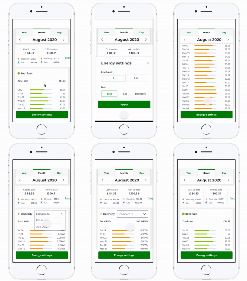
- For the Mobile version I identified and added the following features:
- 1. Tab navigation for Year/month/day on top of the page, which made the day page very visible which was previously very hard to find
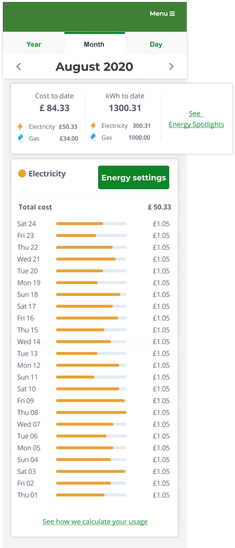
- 2. Created a summary card which showed total cost and total kWh. Total cost and kWh were further split by gas and electricity which gave a clear picture to the user how much they were using and by what fuel
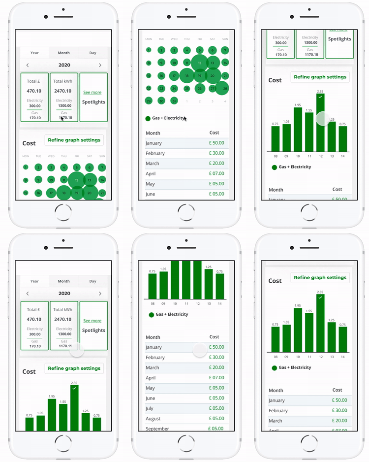
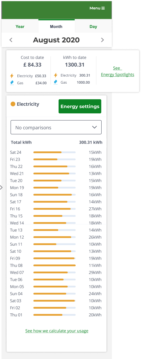
- 3. Created horizontal charts which worked well as charts and tables
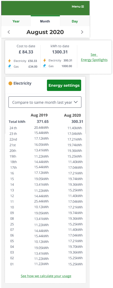
- 4. To compare data between different years and month on mobile I used tables to compare figures
-
User testing
Findings from user testing
Desktop
- We found that designs for desktop tested well
- 1. ⅘ users mentioned that the copy of the comparison button was a little confusing as it mentioned a month and a year. The suggestion was to say something like “compare to last year”
- 2. User expected the comparison to be higher in the page
- 3. The comparison chart was still hard to read and users preferred to see continuity in the comparisons however we understood that thicker lines work better visually against the bars are they were spotted faster but then it was hard to make connections between them
- 4. Copy on summary stat was not clear, as it said Total cost and Total Kwh which users found misleading
-
Mobile
- 1. Users found the copy for the green CTA button misleading as they thought that by clicking the button they will compare their supplier with other companies.
- 2. Users expected the comparison button to appear near the charts and not in the pop-up card as they found making three decisions at one time very confusing.
-
Refinement and testing
Second round of testing for mobile to test navigation and comparison feature
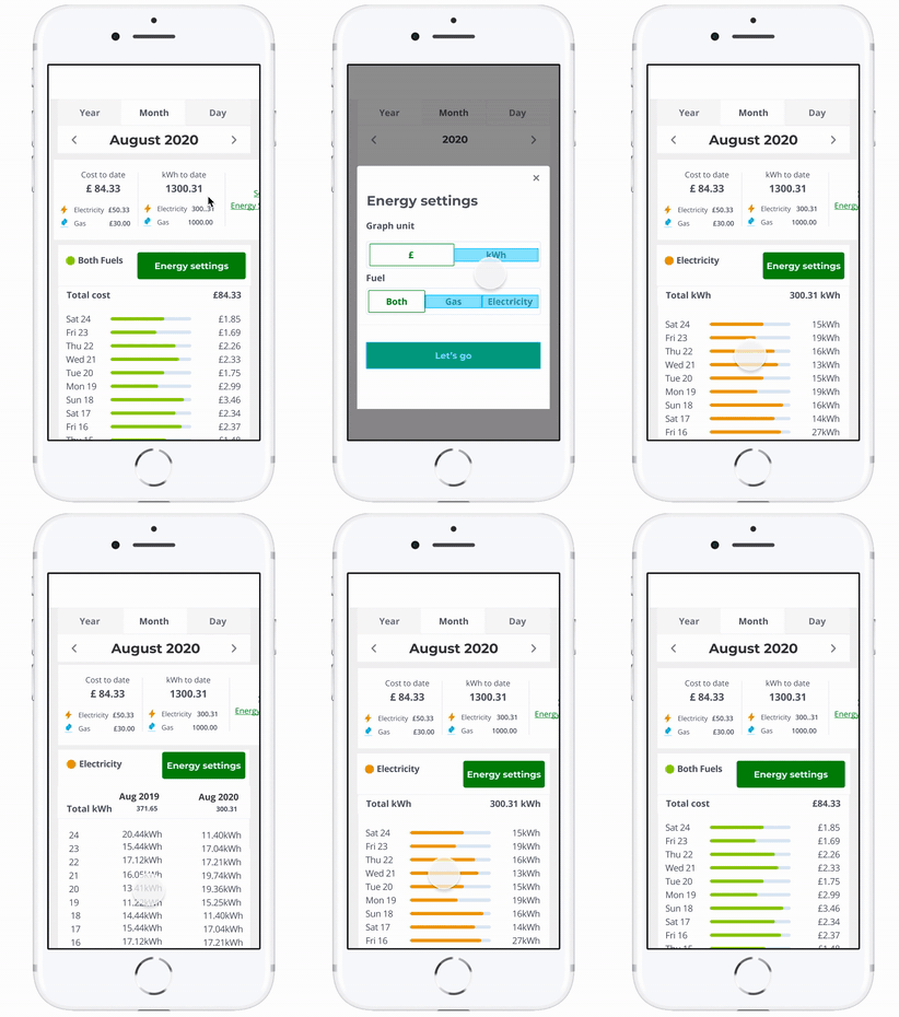
After the findings from the testing, there were some changes made in the mobile designs
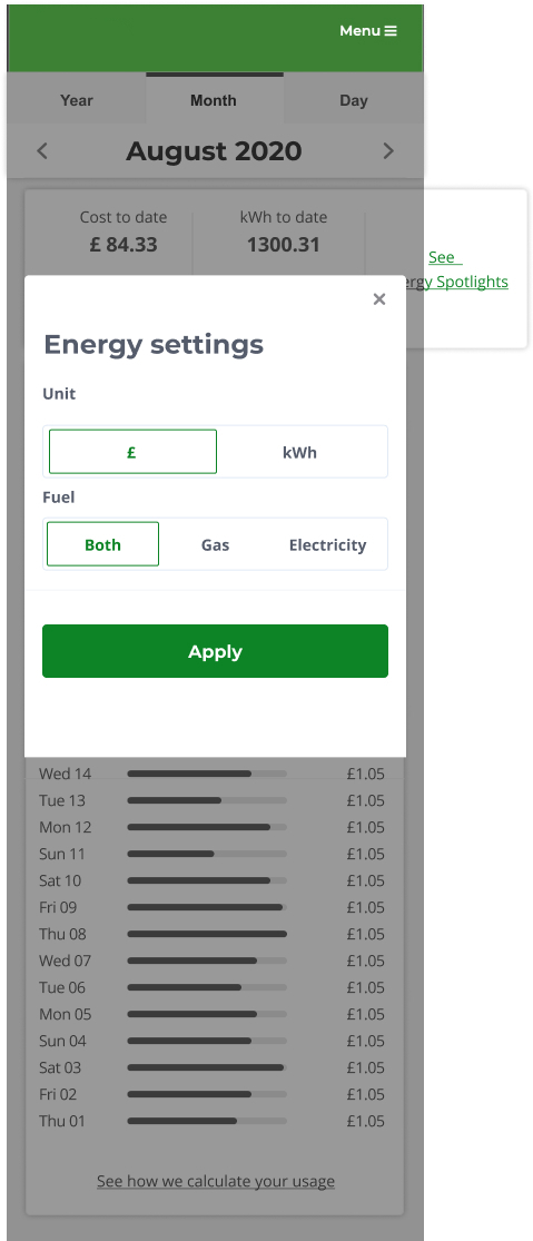
- 1. The copy of the CTA button was changed from “Compare and filter” to “Energy settings”
- 2. Comparison feature was closer to the charts
-
Design 1 for mobile has a floating button at the bottom of the experience. The user can see a drop-down menu for comparison on the top right when they click on kWh. The intention behind a floating button was that it will be visible to the user no matter where they are in the experience and the intent behind the positioning for the drop menu was that it would be easy to spot and will only appear once the user clicks kWh, so it's clear that comparison is only for kWh. Design 2 for mobile has a fixed CTA button on the top right with the comparison button at the bottom of the charts.
-
-
Refinement and testing
Second testing to test comparison feature
- 1. Users preferred the CTA button of the second design
- 2. Users preferred the comparison to be shown at the top through a drop-down menu
-
Final designs
Accessibility
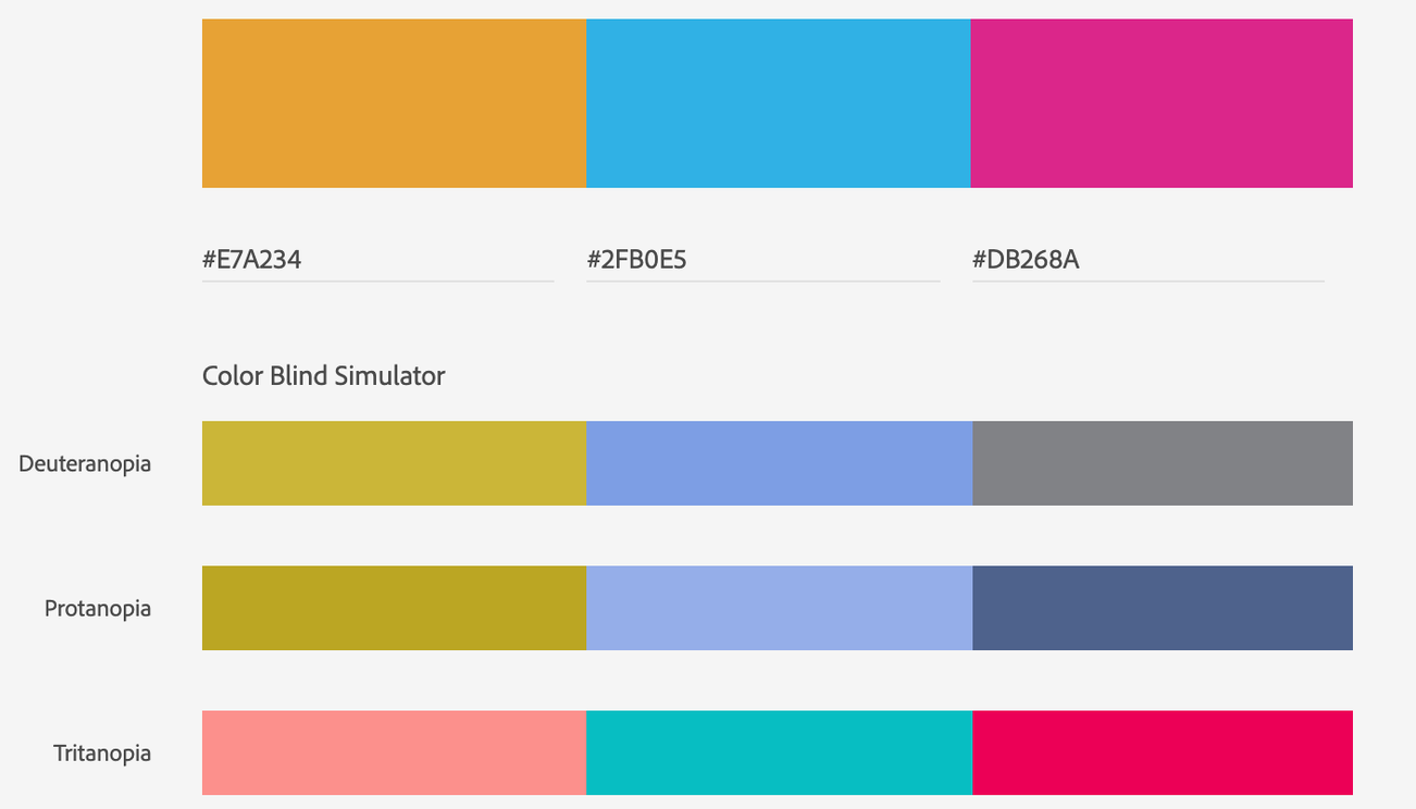
Through further consideration, we understood that green looks like the same colour as orange to colour blind users. As we use orange in our charts to show electricity, we decided to replace the green with another colour from the brand palette which was magenta. That would test well with all kinds of colour blindness.
-
-
Final designs
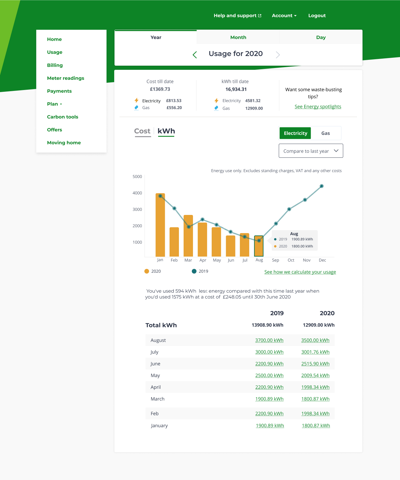
Desktop
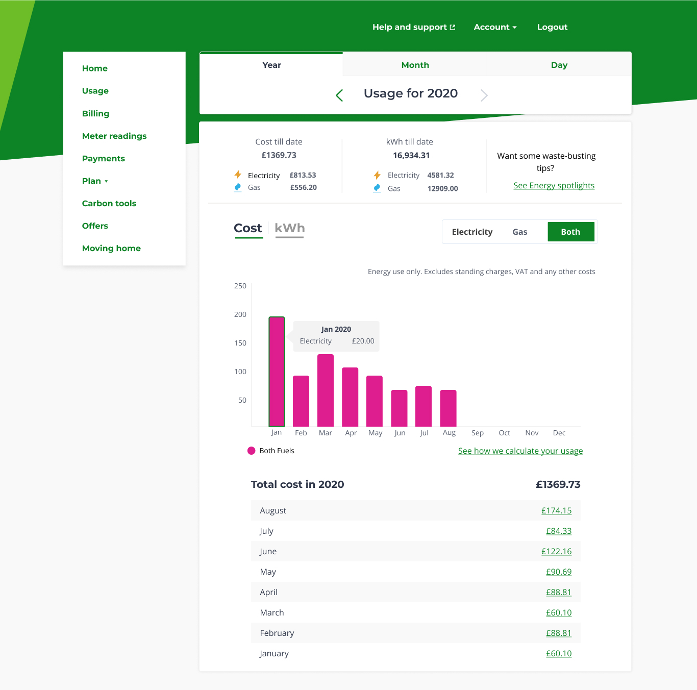
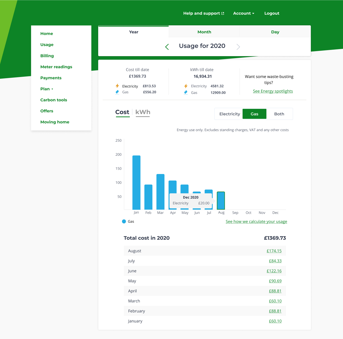
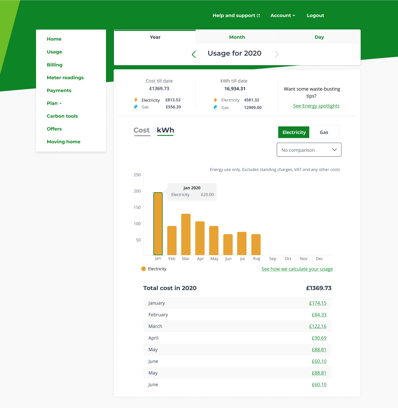
Final designs for the desktop have a more accurate copy and the comparison feature is higher in the information hierarchy. We also went back to the line chart for comparison but made the line chart more bold and prominent for a clear comparison. I also designed the hover bubble to have a short but clear copy, which supported the line chart with the right information. This tested well with the users ⅘ said it was clear and easy to spot.
-
-
Final designs
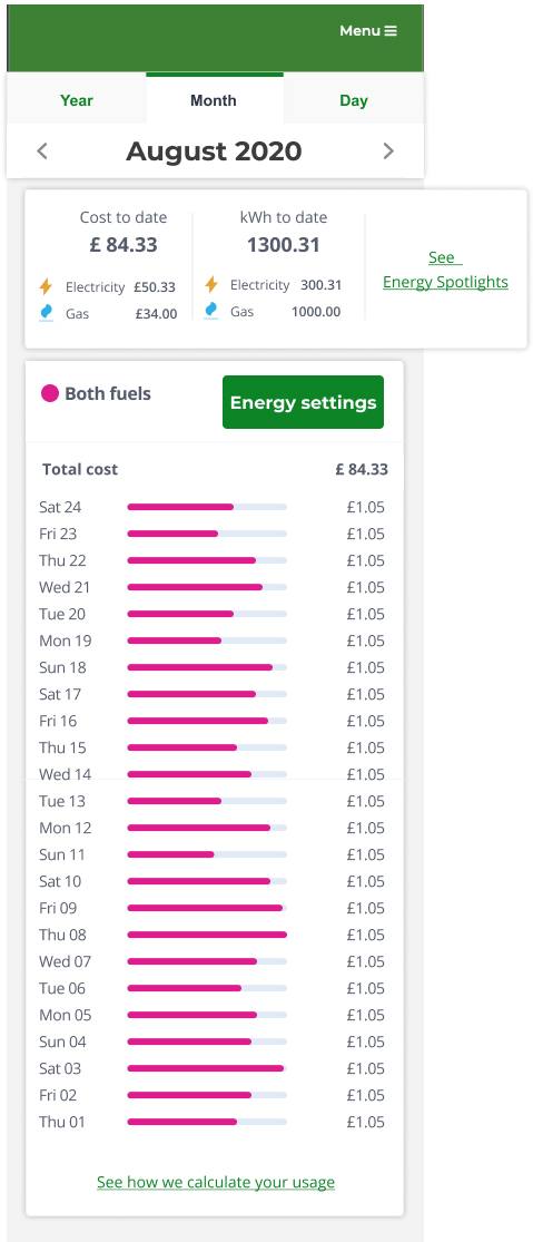
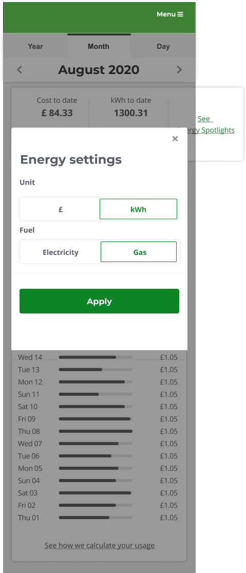
Mobile
Final designs for the mobile have a fixed CTA button with a dropdown bar under it. This tested well with the users and 5/5 could find the CTA button and the comparison.
-
-
Impact
How did we know we were on track?
We decided to launch one feature at a time and measure the CSAT after the release. As we worked in a two-week sprint, we could measure the CSAT after every two weeks or four weeks if there was a pure technical sprint in between. This helped us understand what value each change was bringing and also if we were on the right path. These changes were made only for the desktop version.
With the change in the top navigation of year/month/day, there was also 32% increase in page views on the day page (previously this page was hard to find) in first 30-days of launch. These figures are indicative and not company data. This is to protect company data.
-
-
Next steps
How will we improve CSAT further?
- 1. Next the team will work on deploying the mobile changes and understanding the impact of those changes.
- 2. We will also do research to understand if tables are useful and what kind of comparison will be more meaningful for our users.
